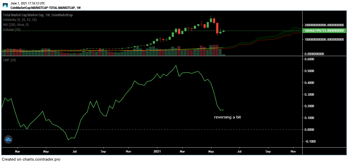
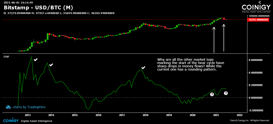
More mark differences between Bitcoin and total market capitalization of all crypto
It bursts my bubble to see that there is a remarkable difference in the Chaikin Money Flow of Bitcoin in the monthly chart. As you can see below,the current
price decline is way different.
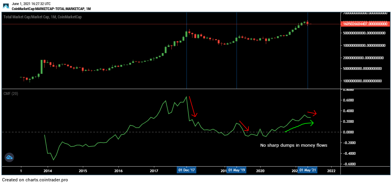
Even in the monthly chart of the total marketcap, there is no sharp dumping. Maybe because most active BTC is in derivative wallets?
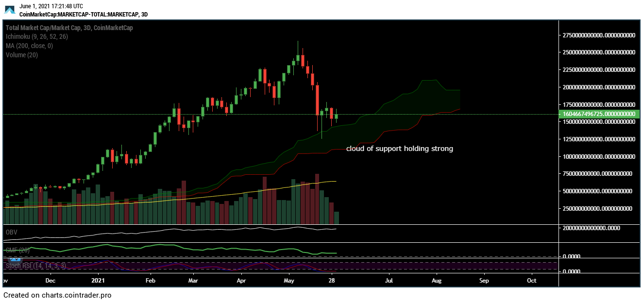
This following chart gives me confidence that the bull market continues. Rarely do I see price break down through a thick cloud of ichimoku support. Maybe
in early May where the cloud was thinner.
The KDJ indicator at the total marketcap weekly chart shows the dumpage was stronger during the last two bear cycles. This does support the fact that the crash
was indeed caused by cascading leveraged stoplosses. There weren’t really that much bitcoin dumped.
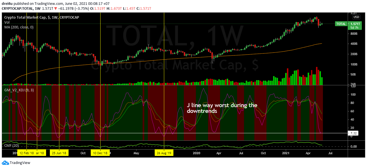
A bit of good news, CMF Indicator for total marketcap weekly chart shows signs of bullish reversal… At last.
